?$dans-daily-web-image$&wid=1280)
The illustrator behind this year’s Loud & Proud labels on honouring love, community and everything in between.
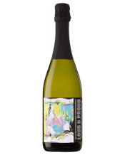
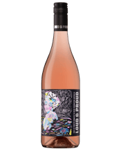
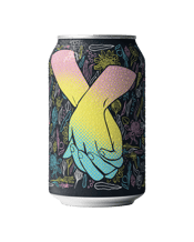
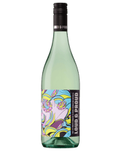
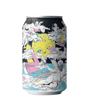
A year on from launch, we’re back with a brand new Loud & Proud drinks range, again raising funds for Pride Foundation Australia (PFA). It’s all about championing the voices of LBGTQIA+ people, with the added bonus of serving up some immensely enjoyable drinks while we’re at it. All profits* from the range will go towards funding the work of PFA, which includes crucial projects that address the systemic disadvantage of LGBTQIA+ communities and individuals across the country.
For this year’s campaign, we reached out to acclaimed artist and illustrator Meg Minkley, whose work leaps off the canvas with a cavalcade of colour. Directly informed and inspired by her own experiences as a member of the queer community, Meg has brought her unique eye to the artworks adorning each label in the Loud & Proud range. The result is a heartfelt homage to the love and sense of community that LBGTQIA+ people celebrate at this time every year.
But who better to tell you about the campaign than Meg herself? We asked her about how her unique illustrations came to be, the inspiration behind her work, and the power of art to inspire and bring people together in pride.


- Q.Who were your biggest inspirations in developing your illustrative style?
“There is no one particular style or aesthetic that influences my hand, it’s definitely a feeling, place, someone or something that resonates with me, fuelling my fire to colour. My two book-end artists are Frida [Kahlo] and [Jean-Michel] Basquiat – their ability to paint experience with emotion, colour with pain; make shapes that embrace their own selves, looking to shadow; the light, the dark and random scribbles of thought. These inspirations move my heart’s insides and speak to the human experience. I also love the aesthetic details in the fantastical lands of Del Kathryn Barton and the ice cream paint puffs of Ben Quilty.”
- Q.Bold and bright colours form a recurring theme throughout your art and the new artworks you've developed for the range. Why do you think bright colours have become such a powerful statement of pride?
“I feel like a kaleidoscope of colours speaks to the heart of everyone, every body, all shapes and stories. It’s not about a simple rainbow – it’s about the whole spectrum of colour that illustrates a universe of people, a galaxy of heartbeats and a never-ending story of love, connection and equality. A prismatic palette will forever be powerful as it includes every shade – light, dark and all that bounces in between – and this is what Pride is to me: every single human and every individual experience.
“It is true that every human experience (the good, the bad and the ugly) makes up the inside beauty of that person. I think the insides of our hearts must look like a kaleidoscope of colour from every connection, hurt, heal, hello and goodbye we have over our time – each shade contributing to knowing one’s self, finding our place in the world and seeing our true identity. I reckon this is why bright colours have become the welcome mat for Pride, as I bet there is not one colour in that spectrum that doesn’t speak to someone’s individual story, no matter who they are loving.”


- Q.The illustrations draw on classic symbols of love, as well as celebrations of the individual and the community when it comes together. Why was it important for you to celebrate all these experiences?
“The LGBTQIA+ community represents and IS more than just the romantic. After all, it is 2023 and the gap between the queer community and hetero one should be an incredibly slim shadow now – if existent at all. We all move, love and learn the same as everyone else and, I think for too long, society hasn’t been able to see anyone who may look different on the outside as the same on the inside. Instead of looking beyond a traditional love construct, society likes to throw labels at things we don’t understand. I have found in my own understanding of myself and my identity that I never felt I fit into a particular box because I never understood why society had boxes in the first place. Labels are only for packaging, liquor stores and grocery aisles. I paint, draw and cut shapes that illustrate a labelless place where everyone can see a piece of themselves, no matter which community you come from.
“After a couple of decades loving and learning different people, it is only now in my 30s that I recognise I am a queer woman, and that’s not through feeling uncomfortable with labels prior – they simply did not resonate with me, so I struggled to know which “community” I belonged to. I have always just been a Meg, and now it fits for me that I am a queer Meg and what an epic way to be – peculiarly strange and different. And what a joy it is to be different. While we are still navigating a label-filled universe, I create to understand not only myself but also the world around me, which is why, for me, it is paramount to paint spaces that speak to the shapes and spaces inside everyone, and step right outside of any box we were told to stay in.”
- Q.Lots of brands are doing pride-themed promotions these days. As a member of the LGBTQIA+ community, what struck you as different about this campaign and made you want to get involved?
“I was immediately taken by the fact that 100% of the profits* for the Loud & Proud range goes to Pride Foundation Australia. I was also pretty happy that finally, here’s a corporate company giving the platform to a queer artist to create for the LGBTQIA+, rather than a heterosexual artist. It made for a very holistic campaign straight out the gates. Not only is it a beautiful project supporting queer artists and community, but at the end of the day I was illustrating cans for a cause. Name a better campaign. I’ll wait…”
Find the Loud & Proud drinks range online or in-store across Australia in select Dan Murphy’s stores.
* Endeavour will donate to the Pride Foundation an amount equal to the retail price that you pay minus the wholesale cost to us of sourcing the product, for each unit of product. Endeavour will absorb all other overhead costs associated with facilitating the sale of the goods to you.